

Recently at Tines, we found ourselves with something of an “evolutionary” approach to CSS. That is to say that while we certainly had CSS and that CSS certainly worked, there didn’t seem to be any master plan or guiding intelligence behind its design.
We had a mix of Tailwind, SASS, CSS modules and healthy doses of inlined styles with no clear guidance on which approach was preferred. This is all perfectly normal and reasonable in the early days of a start-up where there are green fields in all directions and progress is the most important thing.
However, as our team grows and our product matures this sort of cavalier approach starts to have a cost. Most acutely, new members of the team can't tell what the right thing to do is, and will waste time understanding the various options and choosing between them. Also, it’s been my experience that in the presence of two equally acceptable ways of doing things engineers will almost inevitably invent a third.
The scatter-gun approach to CSS also had real-world product implications. We’re asked fairly regularly about adding a dark mode, but with such a scattered approach to styling, it was difficult to imagine doing this without creating an even bigger mess.
Finally, we were shipping what I can only describe as an astonishing amount of CSS to our customers. More on that below.
Picking a CSS Philosophy
There were really two levels of decision we needed to make here. First, there was a broad decision on which general approach to CSS we wanted to take. There were a few options we needed to pick through here:
1. Inline
First off I’d like to call out that having some inlined CSS in your app is fine. It’s definitely not the way you should predominantly write CSS but you also shouldn’t feel like you’ve committed a crime when you do it. It’s often expedient to do it, and very unlikely to cause a problem. Our favoured approach to CSS should acknowledge this reality and provide some guidance on when inline styles are appropriate.
2. Utility First
Tailwind has become pretty popular and its “utility first” approach is a really interesting paradigm shift in CSS. Since we already had Tailwind in our app there was definitely a path we could take where we just doubled down on Tailwind and adopted it everywhere.
However our experience with Tailwind wasn’t great, we found a few problems with it:
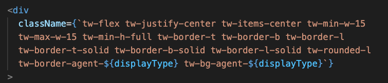
Blocks of Tailwind classes were difficult to interpret and made code pretty obscure. For example, how am I supposed to understand what on earth is going on here in the screenshot above. To me, this seems like a massive step backwards from some nicely formatted CSS. Sure this is pretty pathological and maybe we’re terrible engineers for allowing this to happen, but this is real code in a real app written by real people, and it's not particularly unusual in our app, so I’m not inclined to discount it as an aberration.
Tailwind was responsible for most of our CSS payload bloat. Our Tailwind config had gotten so out of hand that it was emitting 107,000 lines of CSS to our bundle. Now, this is arguably our fault because we were not running auto purge as part of our build pipeline, but on the other hand, the naive approach Tailwind has to purging is also pretty dangerous and wouldn't work for us. As you can see above it turns out we build some Tailwind class names using string concatenation. Sure, we shouldn't do this, but I think as engineers we should aim higher than stern warnings when it comes to preventing mistakes. If people can make mistakes, they will, and only finding out about them when they break in prod isn't good enough.
We also found ourselves regularly consulting documentation to deduce the correct Tailwind class name for things we could quickly write directly in CSS without any documentation. This is one of these classic leaky abstraction problems where you wind up having to understand both the underlying technology and the abstraction on top of it.
The final annoyance for me was trying to quickly debug styling issues in developer tools. Tailwind doesn’t make this easy at all and it’s a pretty ingrained part of my workflow as a web developer going all the way back to Firebug! Having to futz around with the class string in the HTML inspector was pretty unpleasant and feels like a step backwards.
So utility first/Tailwind wasn’t going to be our favoured approach.
3. CSS modules
We also had CSS modules in our app, so they had something of an incumbency advantage and were worth considering. There’s nothing particularly bad about them, they work just fine, allow you to write regular old CSS, prevent classname collision and have some type of awareness. However, they’re also fairly limited in functionality, particularly around global scoping rules and sharing rules between modules where the approach of just importing the module and re-using its classnames feels prone to mistakes.
4. CSS in JS
Given the limitations discussed above we started to find the idea of adopting a CSS in JS approach pretty compelling. It feels like a natural next step from JSX and Relay, where you wind up with one file that expresses everything about a component from data dependencies right through to styling.
We’re also pretty heavily invested in Typescript and have found stability gains from making our app increasingly type aware. CSS in JS offers an opportunity to bring some type safety into our styles too.
Picking a CSS in JS framework
After laying out the options, we were all pretty convinced that CSS in JS (with some room for the occasional inline style!) was the way forward, but there are many options out there to choose from so we decided to do a CSS-In-JS bake-off to pick a winner.
We came up with a simple but hopefully representative set of tasks to try our candidate frameworks against. The tasks were:
Set the framework up in our build pipeline
Switch the styling of our Button component from CSS modules to CSS in JS
Sketch out a basic dark mode with a switch to enable it which would invert the main background and text colours and change the button colours.
This set of tasks was enough to get done pretty quickly but also enough to stretch a framework's legs a little and really get hands-on with it. Step three, in particular, involved getting hands-on with “themeing” support and required touching various parts of our app and getting things to play well together.
The candidates we wound up choosing were Styled-Components, JSS, Styled JSX, Linaria and Stitches.
The results
After spending a day or two reading docs, and hacking together spike code we were surprised to find ourselves in love with Linaria.
Its selling points resonated with me, particularly the way it was a build time only dependency. This removed any risk from introducing a large run-time dependency and it seems to naturally limit the complexity of the library.
While it’s definitely not as mature or widely adopted as some of the other contenders, it is well documented and has a reasonably large community behind it. This lack of maturity comes with maintenance risks, but we satisfied ourselves that its API is sufficiently similar to other approaches that we could probably migrate away from it with only moderate pain, especially given that our React app is relatively small.
Shipping it
The final hurdle to clear once we had decided the approach was to get it seeded in the app. In a larger company, this would probably involve writing migration documentation, chatting to stakeholders, getting time allocated on other teams' roadmaps, etc. Thankfully we're still quite small and scrappy, so instead, this wound up consisting of me taking a few days to bash through the app and seed the new approach.
It would also act as a last chance to find some reason this was a terrible approach and nope out of it entirely. This hasn’t turned out to be the case and we’ve found Linaria really pleasant to work with. We’ve particularly enjoyed turning things like:
<div className={`tw-flex tw-relative ${cs.profile}`}>
  <Dropdown
    opener={
      <button className={`${cs.button} tw-items-center`}>
        <GeneratedAvatar size="M" email={viewer.email} />
        <div
          className="tw-ml-3 tw-flex-1"
          style={{
            overflow: "hidden",
            textOverflow: "ellipsis",
          }}
        >
          {viewer.firstName} {viewer.lastName}
        </div>
        <Icon
          className={`hover:tw-bg-structure-medium ${cs.moreTrigger}`}
          name="moreNew"
          boundingDivSize={16}
        />
      </button>
    }
    contents={
      <div
        style={{
          position: "absolute",
          left: "calc(100% - 24px)",
          background: "white",
        }}
      >
        <PopoverActions
          groups={buildDropdown(
            viewer.isAdmin,
            isOnboarding,
            setIsOnboarding
          )}
        />
      </div>
    }
  />
</div>
Into this:
<Styled>
  <Dropdown
    opener={
      <Opener>
        <GeneratedAvatar size="M" email={viewer.email} />
        <Name>
          {viewer.firstName} {viewer.lastName}
        </Name>
        <Icon className="more" name="moreNew" boundingDivSize={16} />
      </Opener>
    }
    contents={
      <PopoverHolder>
        <PopoverActions
          groups={buildDropdown(
            viewer.isAdmin,
            isOnboarding,
            setIsOnboarding
          )}
        />
      </PopoverHolder>
    }
  />
</Styled>
It’s so much easier to read and understand the intent of the migrated code. It seems like more semantic and readable JSX just falls out of this new approach.
Wrapping up
So this is where we find ourselves now:
CSS modules are gone:

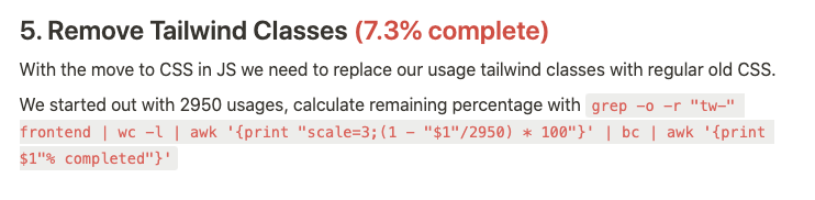
And we still have a ways to go before we kill off Tailwind:
We’ve found that adding an entry to our “Migrations in progress” page in Notion keeps things like this visible and allows us to celebrate progress towards keeping our codebase lean and efficient.
Who knows exactly how long it will take us to get this over the line but we have 11 of these migrations under our belt since we introduced this page less than a year ago, so I’m confident it will happen pretty quickly!
Some portions of the app are also “dark mode ready”, i.e. styles are structured such that we can easily add dark mode so there’s a path established and once we complete the migration away from Tailwind we will be ready to drop dark mode.
In the meantime, we have a solid approach to CSS and a clear understanding of how and why we chose it.